

Sapfo® | Basic
Papadellis is a family business that specializes in the production and processing of olive oil in Mytilene, since 1980.
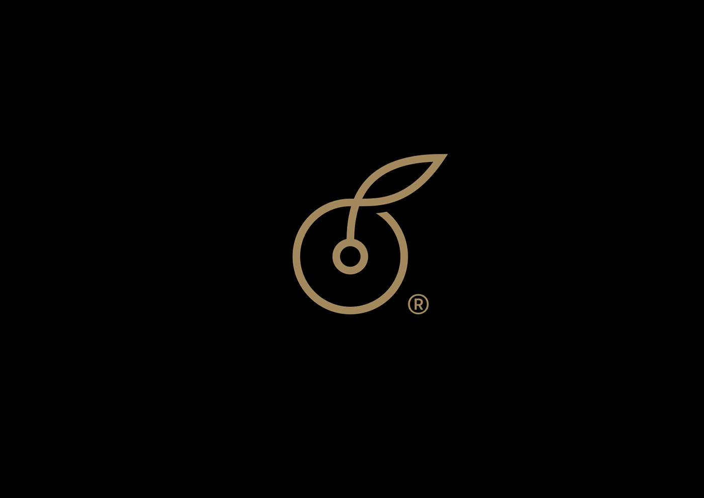
Symbol of the logo is the flower of the olive tree, which in a single stroke forms a “sfirida” (a special filter consisting of a round and flat mesh of coarse fibers used in the olive oil press), in order to visualize the integrated services that the business offers, from the harvest up to the production process.
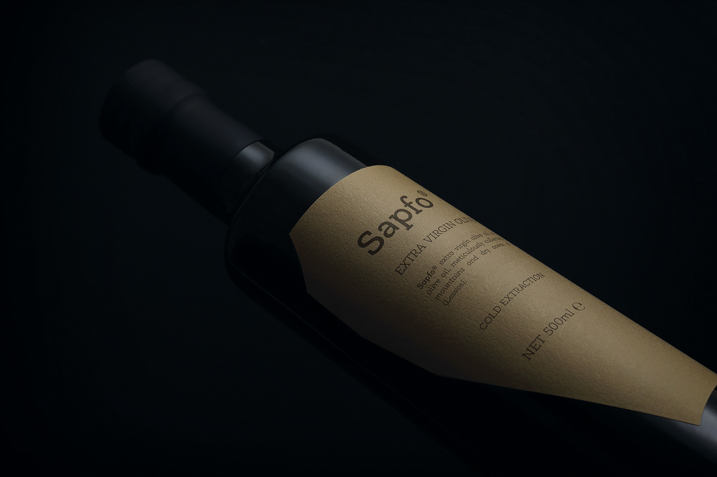
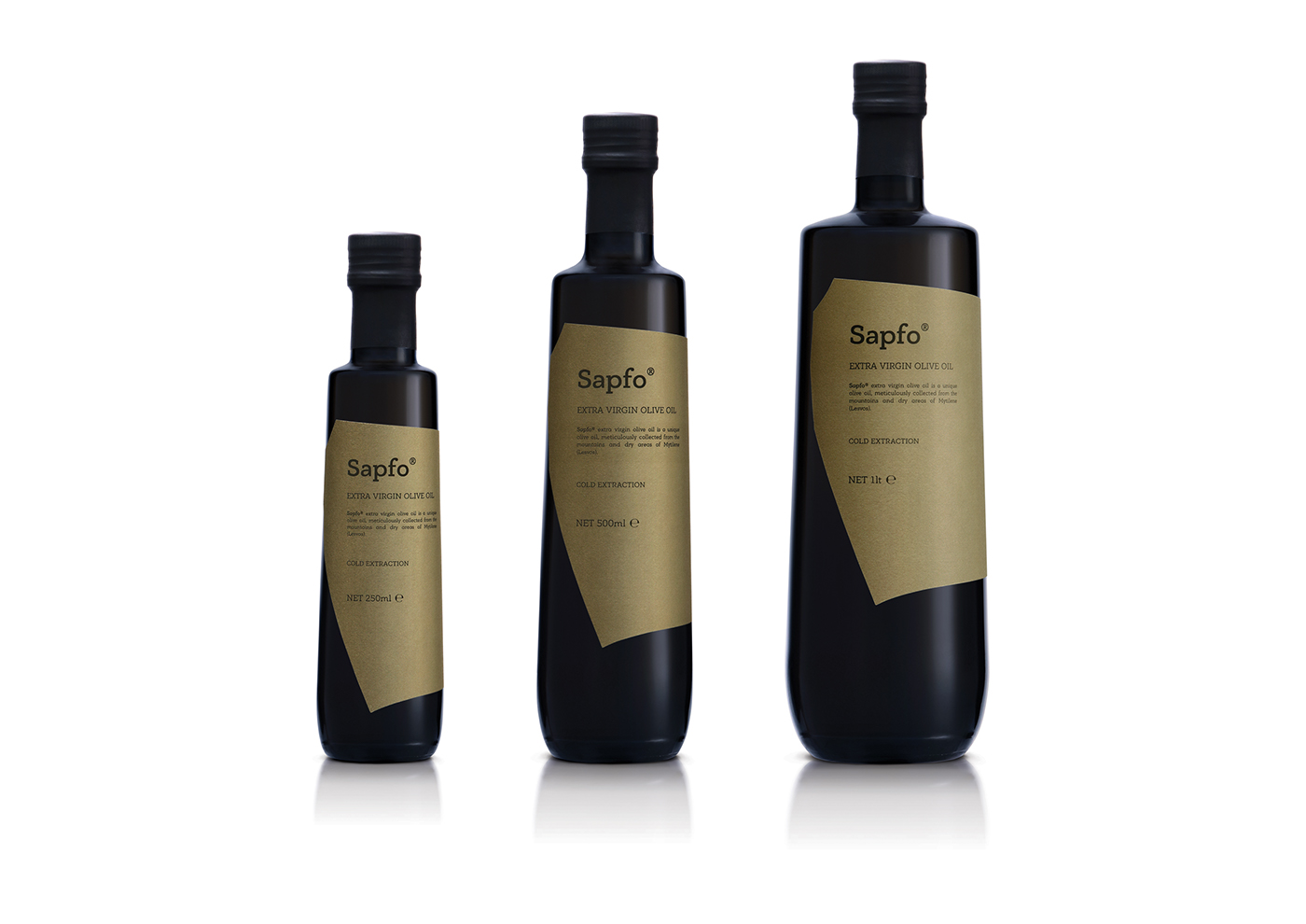
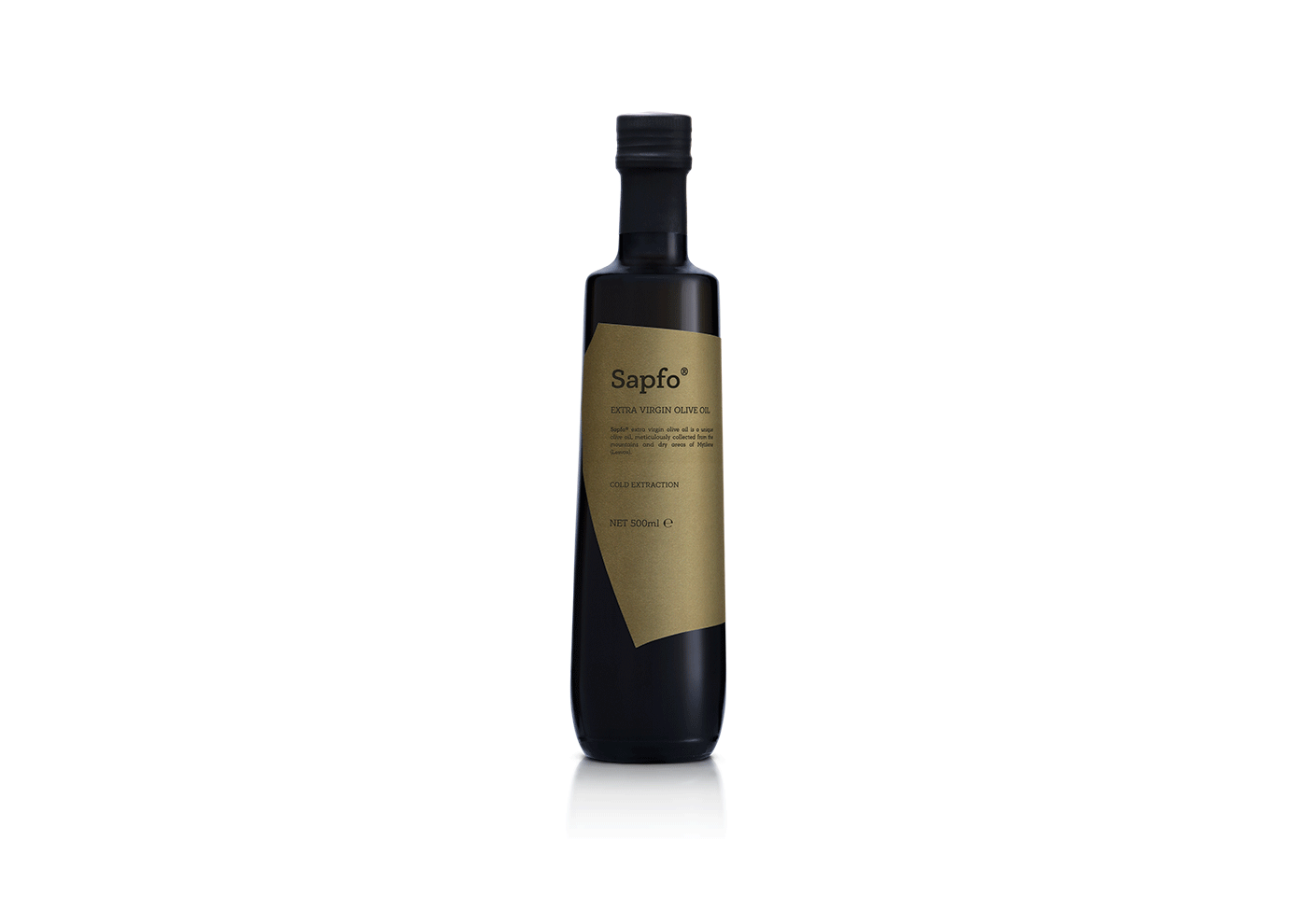
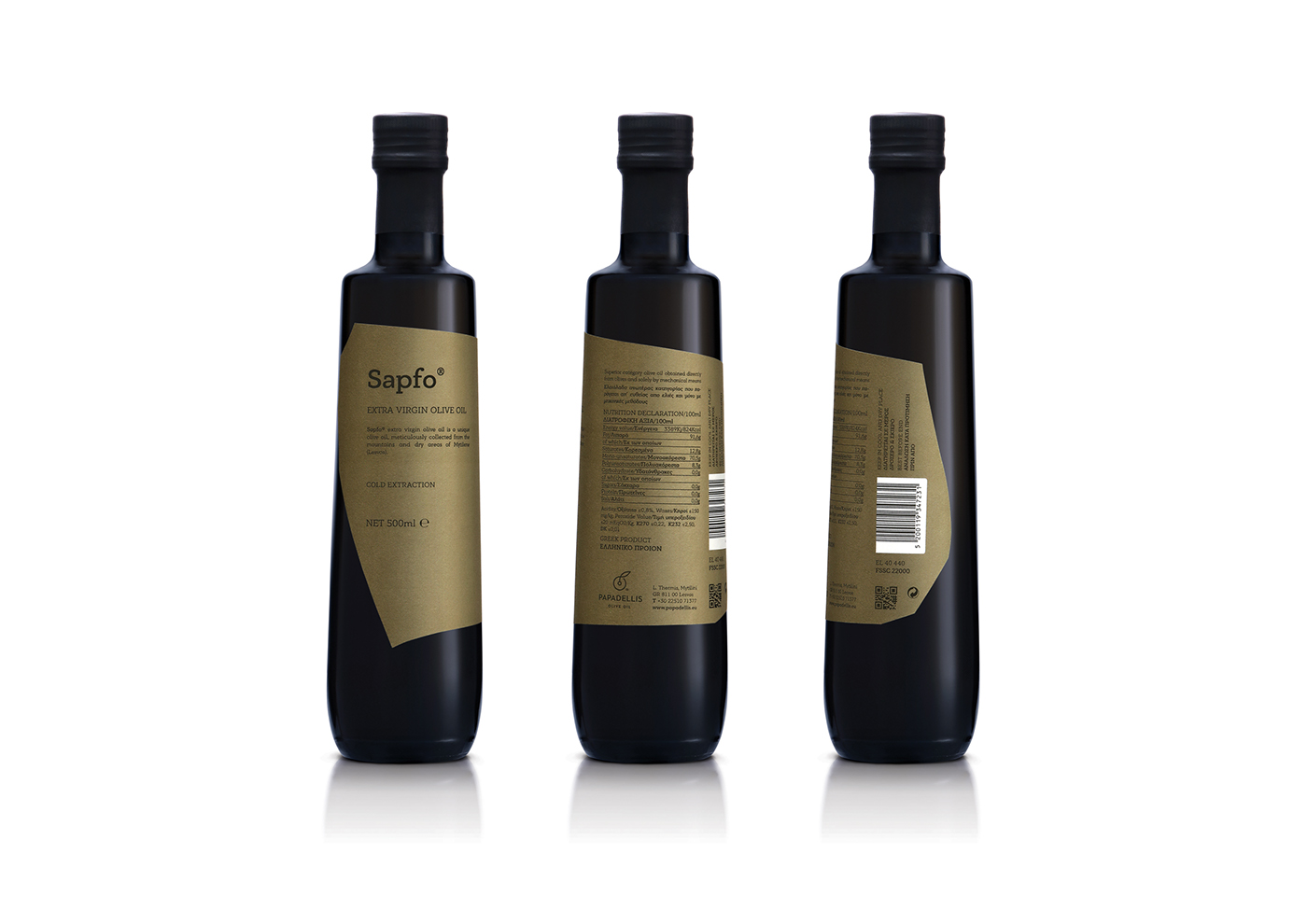
Sapfo® extra virgin olive oil is a unique olive oil, meticulously collected from the mountains and dry areas of Mytilene (Lesvos).
The name Sapfo® is inspired by the poetess Sappho, the tenth muse according to Plato, born in Mytilene (Lesvos).
For the Basic series, a bottle with a special “tear” shape was selected, in order to remind the flow of the olive oil.
The shape of the tag of the bottle was inspired by ancient pottery pieces. The colors and typography create a plain label that aims to travel the consumer to the simplicity of ancient times and to tradition.
_
Η οικογενειακή επιχείρηση 'Παπαδέλλης’ ασχολείται από το 1980 με την παραγωγή, συγκομιδή και τυποποίηση ελαιολάδου στη Μυτιλήνη.
Σύμβολο του λογοτύπου αποτελεί ο ανθός της ελιάς, ο οποίος σχηματίζει με μονοκονδυλιά μια ‘σφυρίδα’ (εργαλείο του ελαιοτριβείου, το οποίο αποτελείται από ένα στρογγυλό και επίπεδο πλέγμα από χονδρές ίνες που λειτουργεί ως φίλτρο), ώστε να οπτικοποιήσει τις ολοκληρωμένες υπηρεσίες που παρέχει η επιχείρηση, από τη συγκομιδή μέχρι και την παραγωγική διαδικασία.
Το Sapfo® extra virgin olive oil είναι ένα µοναδικό ελαιόλαδο, η περισυλλογή του οποίου γίνεται σχολαστικά και µόνο από ορεινές και ξερικές περιοχές της Μυτιλήνης (Λέσβο).
Το όνοµα Sapfo®, είναι εµπνευσµένο από την ποιήτρια Σαπφώ, τη δέκατη µούσα σύµφωνα µε τον Πλάτωνα, που γεννήθηκε στη Μυτιλήνη (Λέσβο).
Για τη σειρά Basic επιλέχθηκε μια φιάλη με ιδιαίτερο σχήμα, που παραπέμπει σε δάκρυ και δημιουργεί συνειρμό με τη ροή του ελαιολάδου.
Έμπνευση για το κοπτικό της ετικέτας της φιάλης αποτέλεσαν τα σπασμένα κομμάτια αρχαίων αγγείων. Τα χρώματα και η επιλογή της τυπογραφίας δημιουργούν μια λιτή ετικέτα που σαν στόχο έχει να ταξιδέψει τον καταναλωτή στην αρχαιότητα και την παράδοση.
The shape of the tag of the bottle was inspired by ancient pottery pieces. The colors and typography create a plain label that aims to travel the consumer to the simplicity of ancient times and to tradition.
_
Έμπνευση για το κοπτικό της ετικέτας της φιάλης αποτέλεσαν τα σπασμένα κομμάτια αρχαίων αγγείων. Τα χρώματα και η επιλογή της τυπογραφίας δημιουργούν μια λιτή ετικέτα που σαν στόχο έχει να ταξιδέψει τον καταναλωτή στην αρχαιότητα και την παράδοση.
CLIENT Papadellis Olive Oil
CONCEPT & DESIGN Chris Trivizas
EDITOR Sissy Caravia
EDITOR Sissy Caravia
TYPEFACE Parachute® Typefoundry
©2019


